
The moment a customer sees your brand for the first time, they feel something. Before they read your tagline, before they look at your pricing, before they even know what you do — the colors you’ve chosen have already created an emotional impression. That’s not a metaphor. It’s neuroscience.
Color accounts for up to 90% of a snap judgment about a product or brand, according to research on visual perception and buying behavior. For small business owners in the US, Canada, and Australia competing in crowded local markets, your brand color palette isn’t just a design choice — it’s a silent salesperson working 24 hours a day.
After nine years designing brand identities for small businesses across three continents, I’ve watched the wrong color palette cost businesses real money — and I’ve watched the right one transform how an entire market perceives a brand. This guide will help you understand what your colors are communicating right now, and how to choose a palette that actually works for your business.
Why Color Psychology Matters More Than You Think
Your brain processes color in the visual cortex before the analytical part of your brain gets involved. By the time you’ve consciously registered what you’re looking at, you’ve already formed an emotional response based on color alone. For brands, this means color creates trust, urgency, warmth, authority, or playfulness — before a single word is read.
This isn’t about picking colors you personally like. It’s about choosing colors that resonate with the specific emotions your customers need to feel before they’ll trust you with their money.
What Each Color Actually Communicates
Blue — Trust, Reliability, Professionalism
Blue is the most universally trusted color in business branding. That’s why you see it dominating finance, healthcare, technology, and professional services. When a plumber, accountant, or insurance broker uses blue, they’re tapping into a deeply conditioned response: blue means “safe” and “reliable.” For service businesses where trust is the primary barrier to getting hired, blue is often a smart foundation. The shade matters enormously though — navy communicates authority and tradition, while bright sky blue suggests innovation and approachability.
Green — Health, Growth, Nature, Sustainability
Green is the color of life, and it triggers associations with health, freshness, environmental responsibility, and financial growth. It works brilliantly for wellness businesses, organic food brands, landscaping companies, financial advisors, and any brand whose core promise involves helping customers thrive. Our client GreenLeaf Organics in Denver built their entire visual identity around a deep earthy green — and it became central to why customers chose them over conventional competitors.
Orange — Energy, Enthusiasm, Affordability
Orange is the friendliest color in the spectrum. It radiates warmth and energy without the intensity of red, and it communicates approachability and value. It’s why Amazon, Home Depot, and Harley-Davidson all use orange — it connects with a broad, everyday audience. For service businesses that want to feel accessible and energetic rather than corporate and distant, orange creates genuine warmth.
Red — Urgency, Passion, Action
Red demands attention. It raises the heart rate slightly, creates a sense of urgency, and drives action — which is exactly why it dominates food, entertainment, and retail. For small businesses, red works best in calls-to-action and accent elements rather than as a primary brand color. Red says “act now” and “don’t miss this,” making it powerful in sale announcements, CTAs, and promotional elements.
Purple — Luxury, Creativity, Wisdom
Purple has historically been associated with royalty and exclusivity — and that association still holds in modern branding. Deep purples communicate luxury, premium quality, and sophisticated taste. Lighter violets suggest creativity and imagination. For beauty brands, premium wellness businesses, creative agencies, and any business positioning itself at the high end of its market, purple can be a powerful differentiator.
Black — Sophistication, Luxury, Authority
Black communicates sophistication, exclusivity, and premium positioning. It’s timeless, never trendy, and consistently associated with the highest quality. For businesses targeting a premium market — high-end restaurants, luxury real estate, premium skincare, couture fashion — black signals that this is not a budget option. The risk of black is feeling cold or unapproachable, which is why most black-dominant brands use warm secondary colors to humanize the experience.
The 3 Most Common Brand Color Mistakes Small Businesses Make
Mistake 1: Copying Competitors
If every other plumber in your city uses blue and white, using the same palette doesn’t make you look professional — it makes you invisible. The goal of branding is differentiation, not blending in. A plumbing company that confidently uses deep teal and warm copper stands out immediately in a sea of identical blue vans. You want customers to remember you, and that requires visual contrast with what they’ve already seen.
Mistake 2: Choosing Colors You Like Instead of Colors That Work
Your brand isn’t for you — it’s for your customers. The colors that work for your business are the ones that make your target customer feel what they need to feel to trust you and buy from you. A 55-year-old homeowner looking for a trustworthy local contractor doesn’t need the same emotional triggers as a 25-year-old looking for a creative photography studio. Start with your customer, not with your personal preferences.
Mistake 3: Too Many Colors
Amateur brands have six colors. Professional brands have two or three. Vitalize Wellness came to us with a brand that used five different colors inconsistently across their packaging. After simplifying to a refined two-color palette, their Amazon click-through rate jumped from 1.1% to 4.3%, and sales grew 180% in six months. Simplicity communicates confidence. Visual clutter communicates uncertainty.
How to Build the Right Color Palette for Your Business
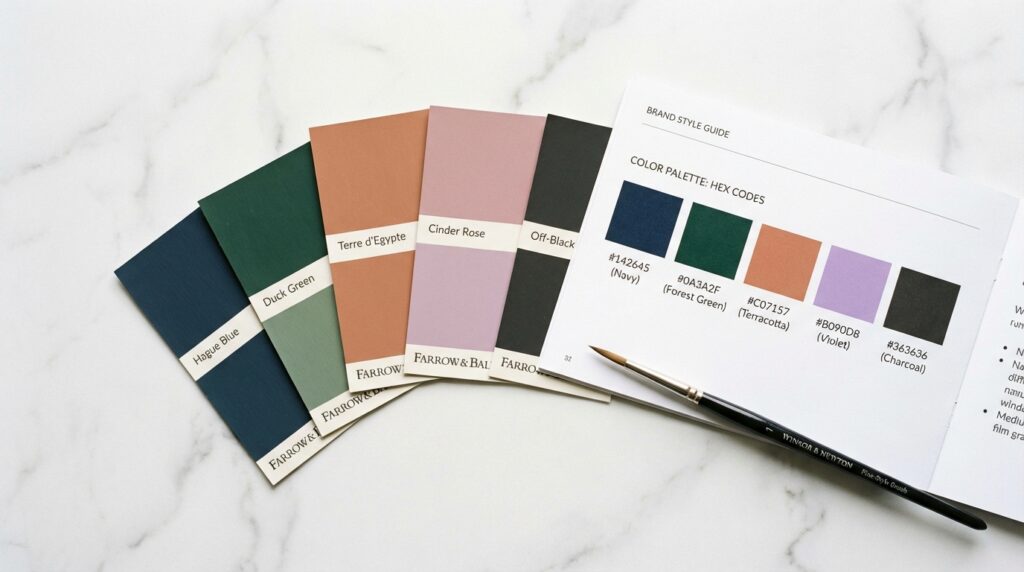
A professional brand palette typically has three components: a Primary Color (the dominant color that defines your brand — used on your logo, key visuals, and primary CTAs), a Secondary Color (a complementary or contrasting color for variety and visual interest), and a set of Neutral Colors (whites, grays, or blacks used for backgrounds, text, and space).
Before choosing colors, answer three questions: Who is my ideal customer, and what do they need to feel before they’ll buy from me? What do my competitors use — and how can I differentiate? What’s the one word I want customers to associate with my brand?
The answer to those three questions will point you toward the right emotional territory. Then work with a professional designer to find the specific shades, tones, and combinations that express that territory in a way that’s uniquely yours.
Ready to Build a Brand That Actually Works?
At SR Orbit, we’ve built brand identities for small businesses across the United States, Canada, and Australia — from local service companies to e-commerce supplement brands. We don’t just make things look good. We design visual systems that build trust, drive recognition, and convert browsers into buyers.
👉 Explore our Brand Identity service or book a free brand consultation — we’ll take an honest look at your current brand and tell you exactly what’s working and what isn’t.