
Picture this.
You’ve spent months sourcing the best Lion’s Mane extract. Your formulation is solid. Your product genuinely works. And then it sits on a shelf — or worse, gets scrolled past online — because the packaging looks like every other beige pouch with a mushroom drawing on it.
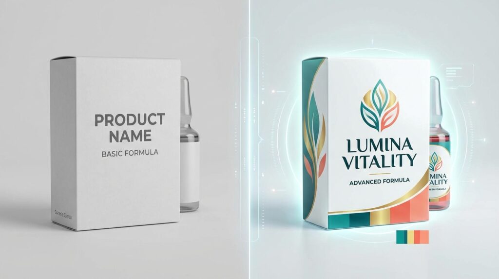
That’s the quiet crisis happening across the functional mushroom industry right now.
The global functional mushroom market is booming — valued at over $8 billion and growing fast, driven by health-conscious consumers across the US, Canada, and Australia who are genuinely excited about Lion’s Mane, Reishi, Chaga, Cordyceps, and Turkey Tail. The demand is real. The opportunity is enormous.
But the brands winning in this space aren’t always the ones with the best mushrooms. They’re the ones with the best packaging.
Why Packaging Is the #1 Marketing Tool for Mushroom Brands
In most product categories, packaging is important. In the functional mushroom space, it’s everything. Most people haven’t tried Lion’s Mane before. They don’t know what Reishi tastes like or what Chaga actually does. When they encounter your product — in a health food store, on Amazon, or scrolling Instagram — your packaging is doing 100% of the selling.
Studies consistently show that 72% of consumers say packaging design influences their purchasing decisions. For health and wellness products specifically, trust signals in the packaging — certifications, ingredient transparency, clean design — are even more critical.
The 5 Elements of Mushroom Brand Packaging That Actually Sells
1. A Clear, Ownable Visual Identity
Walk into any health food store and look at the mushroom supplement section. You’ll see a sea of earthy tones, generic mushroom illustrations, and fonts that all feel vaguely the same. The brands that break through have a distinct visual identity — a specific color system, a recognizable typographic voice, a unique illustration style that feels unmistakably theirs.
2. Color Psychology That Builds Instant Trust
Color is doing heavy lifting before the consumer reads a single word. In the health and wellness space, color choices carry specific emotional weight:
- Deep forest greens — nature, purity, organic integrity
- Warm earth tones (terracotta, burnt sienna, ochre) — grounded, artisanal, premium
- Clean whites and creams — clinical trust, pharmaceutical-grade quality
- Deep navy or charcoal — science-backed authority, biohacker appeal
- Warm golds and ambers — premium, ancient wisdom, adaptogenic heritage

3. Transparent, Scannable Information Architecture
Your packaging needs to answer three questions in the first five seconds: What is this? What does it do for me? Can I trust this brand? The layout hierarchy should guide the eye through these questions naturally — without the consumer hunting for information.
4. Premium Finishes That Signal Quality
- Matte lamination — soft, sophisticated feel that communicates premium quality immediately on touch
- Spot UV coating — selective gloss on logo or key text creates visual depth
- Foil stamping (gold or silver) — instantly elevates perceived value
- Kraft or recycled materials — for eco-conscious, sustainability-forward brands
- Resealable stand-up pouches — the dominant format for mushroom powders and supplements
5. Sustainability Messaging That Feels Authentic
73% of global consumers say they would change their consumption habits to reduce environmental impact — and this skews even higher among health-conscious mushroom supplement buyers. What works is specificity. “100% home compostable pouch.” “Printed with soy-based inks.” Concrete, verifiable claims build trust. Buzzwords don’t.
Mushroom-Specific Design Strategy by Product Type

🦁 Lion’s Mane Packaging
Lion’s Mane is the cognitive performance mushroom. Its audience skews younger, tech-savvy, and research-oriented. Clean, modern, minimal design with clear clinical benefit statements (“Cognitive Function,” “Neuroplasticity Support”) resonates here. Dark backgrounds with crisp white typography perform well. Avoid anything that feels overly rustic — this audience wants science-forward aesthetics.
🔴 Reishi Packaging
Reishi is the ancient wellness mushroom — used for thousands of years in traditional Eastern medicine. Its audience values heritage, calm, and deep wellness. Warm, luxurious design aesthetics work well here — gold accents, deep burgundy or forest green palettes, botanical illustration styles. Packaging that honors the mushroom’s traditional history while presenting it in a contemporary, premium format converts best in the US and Australian premium wellness market.
⚫ Chaga Packaging
Chaga is the rugged, wild-harvested immunity mushroom — often sourced from birch forests in Canada, Scandinavia, or Siberia. Its audience values wild-crafted authenticity. Earthy, textured aesthetics with dark tones work well. Emphasizing sourcing origin (“Wild-Harvested from Canadian Birch Forests”) is a powerful differentiator.
🟠 Cordyceps Packaging
Cordyceps is the performance and energy mushroom — popular with athletes and active lifestyle consumers. Energetic, dynamic design systems with strong contrast and bold typography work here. The key benefit message should center on physical performance, endurance, and oxygen utilization.
The Biggest Packaging Mistakes Mushroom Brands Make
- Looking like everyone else — same earthy tones, same generic mushroom icon, same sans-serif font as eight competitors on the same shelf
- Cramming too much on the front panel — the front is a billboard, not a Wikipedia article. Save detailed info for the back panel.
- Ignoring e-commerce readability — test your design at 100×100 pixels. If the brand name isn’t readable as a thumbnail, it needs work.
- Skipping brand guidelines — without documented guidelines, your visual identity fragments every time a new asset gets created.
Frequently Asked Questions
How much does mushroom brand packaging design cost?
A single product packaging design typically starts around $800–$2,500 USD. A full multi-SKU packaging system with brand guidelines generally runs $2,000–$6,000+. At SR Orbit, we offer competitive rates for mushroom brand founders — reach out for a custom quote.
How long does a packaging design project take?
A focused single-product packaging project at SR Orbit typically takes 2–3 weeks from kickoff to print-ready delivery. Multi-SKU projects take 4–6 weeks.
Do I need separate packaging for Amazon versus retail?
Not necessarily separate designs — but your packaging should be optimized for both. For Amazon, thumbnail readability is critical. For retail, shelf impact and tactile finish matter more. A well-designed system accounts for both from the start.
Can you design packaging for a mushroom brand not yet launched?
Absolutely — and this is the best time to get it right. Building your brand identity and packaging before launch means everything starts from a consistent foundation. It’s far less expensive than redesigning after you’ve already printed 10,000 pouches.
The Mushroom Market Is Growing Fast. Your Packaging Needs to Keep Up.
In a market growing this fast, packaging that stands out isn’t a luxury — it’s a competitive necessity. Whether you’re launching your first Lion’s Mane powder or building a full functional mushroom product line, the brands that win invest in design as seriously as they invest in their formulations.
At SR Orbit, we help mushroom brands build packaging that earns trust, drives sales, and grows with your business.
Get Your Free Packaging Design Consultation →
SR Orbit is a full-service digital agency and packaging design studio based in Dhaka, Bangladesh. We work with functional mushroom brands across the US, Canada, Australia, and globally.